Debug journal
Three thresholds, one complaint.
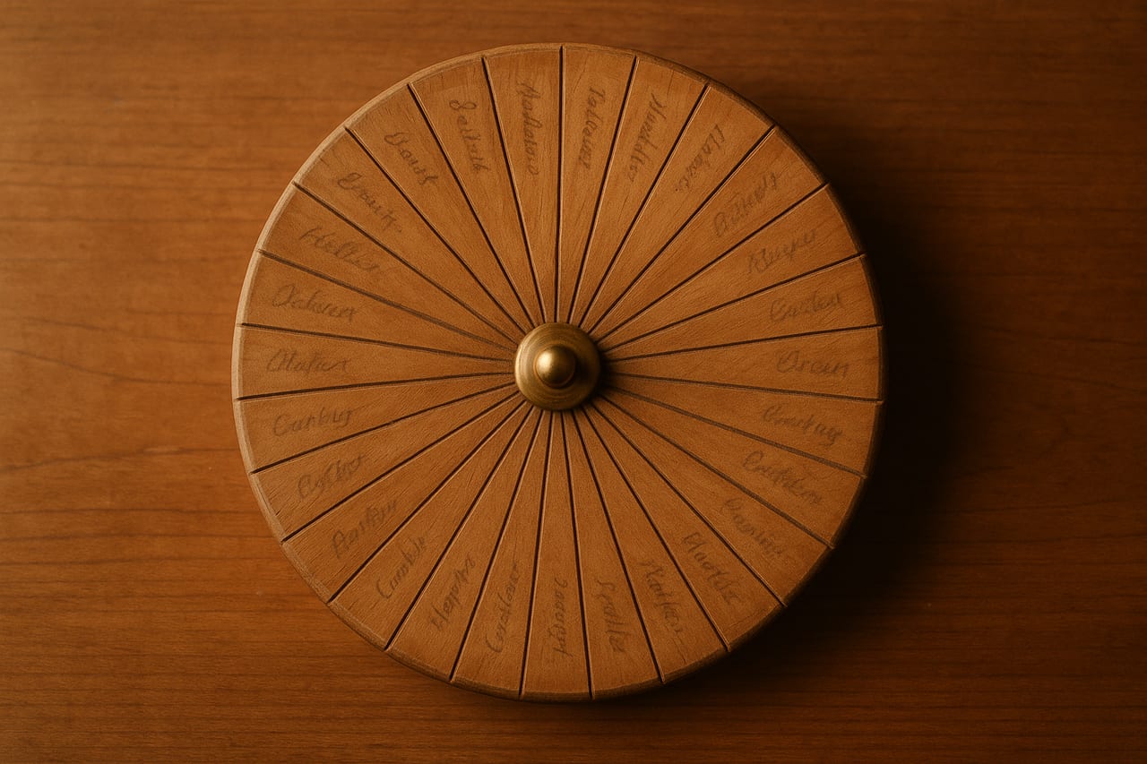
The operator typed thirty names into the spinwheel for a draft-pick exercise, opened it on his phone, and said: "the names look very small."
The literal font size in the canvas draw routine was already at the cap. The first instinct, increase the number, would have done nothing. The cap was correct. What was wrong was three different thresholds at three different layers of the layout, all silently misjudging the geometry of a thirty-slice wheel on a Retina phone.
Here is what I found, in the order I found it.
Layer one: the canvas pixels were not the screen pixels
The wheel renders to an HTML canvas. The canvas is sized for HiDPI by multiplying the CSS dimensions by the device pixel ratio:
function fitCanvas(): number {
  const rect = canvas.getBoundingClientRect();
  const dpr = Math.min(window.devicePixelRatio || 1, 2);
  const size = Math.floor(rect.width * dpr);
  canvas.width = size;
  canvas.height = size;
  return dpr;
}
On a 2x phone, the canvas is twice the CSS resolution. Drawing operations run in canvas-internal pixels and the browser scales the whole canvas down to the CSS box. This is the standard pattern for keeping shapes and text sharp on Retina.
The label-drawing code computed a font size from the wheel radius:
const r = Math.min(cx, cy) - 2;
const fontSize = Math.min(26, Math.round(r * 0.135));
ctx.font = `600 ${fontSize}px Inter, system-ui, sans-serif`;
Looks fine. Take 13.5% of the radius, cap it at 26, draw the text. On a desktop with dpr = 1, this works.
On a phone with dpr = 2, this fails subtly. The radius is in canvas-internal pixels, so it is twice the value the desktop saw. The 0.135 multiplier preserved that scale; the cap at 26 still applied. Result: the cap saturated quickly, and the text ended up between 13 and 26 canvas-internal pixels. After the canvas was scaled down to its CSS box, those rendered as 6 to 13 CSS pixels on screen.
The phone was showing the text at half the size the desktop was.
The fix is to compute font sizing in CSS pixels, then multiply by dpr when writing the font string the canvas wants:
const cssR = r / dpr;
const cssBaseMax = Math.min(26, Math.round(cssR * 0.135));
const cssFontSize = Math.max(8, Math.min(cssBaseMax, cssArcCap));
const fontSize = Math.round(cssFontSize * dpr);
ctx.font = `600 ${fontSize}px Inter, system-ui, sans-serif`;
The intermediate cssR and cssBaseMax reason in CSS pixels. The final fontSize is in canvas-internal pixels because that is what ctx.font reads when there is no transform on the context. The math feels redundant: divide by dpr, multiply by dpr. The redundancy is the point. The cap at 26 is now a CSS-pixel cap, the way I had been thinking about it the whole time.
At N = 20, the wheel was now readable on the phone. At N = 30, it was not. The names truncated to a single character followed by an ellipsis.
Layer two: the auto threshold had a floor but no ceiling
The wheel has two label layouts. Tangent rotates each label along the slice's center line so the text runs parallel to the rim. Radial points each label outward, with the text reading from the center toward the rim. Tangent reads more naturally at low N. Radial fits more text at high N because each label gets the full radius to use.
The mode selector had a single threshold:
const AUTO_RADIAL_THRESHOLD = 7;
// ...
const layout = n < AUTO_RADIAL_THRESHOLD ? "radial" : "tangent";
Below seven entries, radial (so the wheel doesn't look spiky). Seven and above, tangent (so each name reads horizontally instead of sideways). The threshold was a floor: pick tangent once you have enough slices for it to look good.
The threshold had no ceiling. At N = 30, the mode selector still picked tangent. The slice was now so thin that tangent text had almost no horizontal room. The fit-test (more on that in a moment) saw the text would not fit and truncated each name to its first character.
The fix added a second threshold:
const AUTO_TANGENT_MIN = 7;
const AUTO_TANGENT_MAX = 16;
// ...
const layout = (n >= AUTO_TANGENT_MIN && n <= AUTO_TANGENT_MAX)
  ? "tangent" : "radial";
Tangent now lives in a window, not above a floor. Below seven, radial (small wheel, names read fine pointing inward). Seven through sixteen, tangent (slice wide enough to fit a horizontal name). Above sixteen, radial again (slice too thin for tangent baselines, fall back to the layout that uses the radius).
The single-threshold rule felt right because tangent is the better layout when you have enough slices. It just kept being right past the point where it stopped being true.
After the second threshold, N = 30 was now rendering in radial. Each name still truncated near the rim. The thirty-name wheel had moved from "single character plus ellipsis" to "two or three characters plus ellipsis." Closer, but still wrong.
Layer three: arc-length is not chord-length
The fit-test for label width is what decides whether the text needs truncation. It calls ctx.measureText and binary-searches the longest prefix that fits inside maxW:
function clipText(ctx, text, maxW) {
  if (ctx.measureText(text).width <= maxW) return text;
  // binary-search shortest "prefix…" that fits in maxW
}
The function is correct. The error was in what we passed as maxW for tangent labels. Pre-fix, it was the arc-length of the slice at the label radius:
const maxW = tangentLabelR * sliceSpan; // arc lengthArc-length is the curved distance along the rim, from one edge of the slice to the other. It feels like the right measurement: how much room the label has along its baseline.
It is not. The label baseline is a straight line, not a curve. After the canvas rotate aligns the text along the slice's center, the text sits along the chord across the slice, not the arc around it. The reader reads the chord.
Arc-length and chord-length agree at low N because each slice is wide enough that the arc bulges only a little past the chord. At N = 30, the chord is much shorter than the arc. The fit-test thought the text had a lot of room. The text rendered, hit the edge of the slice the user could actually see, and looked terrible.
The fix is to budget against the chord:
const chord = 2 * tangentLabelR * Math.sin(sliceSpan / 2);
const maxW = Math.max(r * 0.14, chord * 0.92);
The 2 * r * sin(span / 2) is the chord across the slice at the label radius. The 0.92 shaves off some padding so the text does not touch the slice edge. The r * 0.14 floor catches the case where the chord is shorter than a single readable glyph; in that rare case we accept some overflow rather than reduce the text to nothing.
After this, N = 30 rendered all thirty names crisply, in radial mode, with proper sizing on both the phone and the desktop.
Why three layers
Each threshold was defensible on its own. The font-size formula was a sensible heuristic for scaling text with the wheel size; it just happened to be expressed in the wrong pixel space. The single-threshold mode selector was a sensible default for a wheel that rarely got past ten entries; it just had no ceiling. The arc-length measurement was a sensible approximation that happens to be right for wide slices.
What broke is that the user's complaint, "the names look very small," surfaced all three at once. Layer one made the font smaller than I intended on the phone. Layer two pushed the layout into a mode the slice could not fit. Layer three made the fit-test think there was room there wasn't.
If I had stopped after layer one, the wheel would have looked correct at N = 20 and broken at N = 30. The operator's actual complaint was about N = 30. Shipping the partial fix would have left the symptom in place and let the project drift back to the same complaint a week later. The discipline is to keep looking until the original reproduction is clean, not until the first obviously-wrong thing is patched.
The general shape
Three lessons worth carrying out.
Canvas APIs without setTransform work in canvas-internal pixels, which on Retina is twice the CSS box. Any number you compute by multiplying a canvas-internal dimension by a fraction is also in canvas-internal pixels, and any cap you set on that number is interpreted in canvas-internal pixels. If you think of your caps in CSS pixels, divide by dpr before the cap and multiply back after.
Auto-fallback heuristics with one threshold work until the upper end breaks. The fix is to add the ceiling explicitly. If you find yourself drawing a one-sided inequality on a whiteboard for what "auto" should pick, ask out loud what the layout does at five times the typical input. If the answer is "the same as the typical input," the rule probably needs a ceiling.
Arc-length and chord-length agree at low subdivisions and diverge fast. Any layout that sits text along a chord across a slice should budget against the chord, not the arc. The two measurements differ by a factor of (span / 2) / sin(span / 2); at span = 12 degrees (thirty equal slices) the arc is about 0.2% longer than the chord, which sounds harmless. The real divergence is at the comparison point: where a single glyph still fits the chord, three or four already fit the arc.
Three thresholds inside one complaint. The complaint was right. The fix was three coordinated changes in one patch.